Stole this one from Amy. Bravo, Keith Olbermann.
Friday, November 14, 2008
Wednesday, November 5, 2008
Gotham, a font we can believe in


So folks, we have a winner! Cheers yelled and tears shed as television channels across the nation proclaimed Barack Obama our 44th President! And I have to say, despite my dislike for McCain, the man gave a truly elegant concession speech.
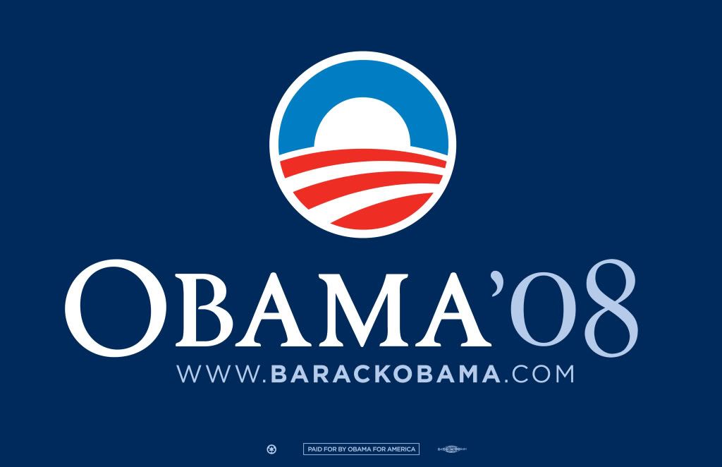
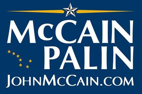
On that note, we switch over to more important matters: typefaces. The fonts used by the candidates for campaign materials for the past few years have been the buzz of graphic designers. A typeface is more than just letters on a page; a typeface is shape and form; a typeface is positive and negative space; a typeface can even evoke certain emotions or create and ambience.
So what's the winning typeface? Gotham! Created in 2000 by American type designer Tobias Frere-Jones, Gotham's design aesthetic is right up there with Futura and Helvetica. I actually didn't get a great example of the typeface in the poster above...Gotham is not used in the "Obama" part, but the website below it. Anyways, Gotham's generous x-height and quirky geometric sans-serif form gives it openness and allows it to appear official and powerful. However, though much of the signage is in all-caps, the strokes in the typeface are humanistic (thick and thin contrast...not blocky), which evoke a friendliness. Case and point: the big round 'O'. So Obama campaign poster designer people--hats off to you! Good choice! Many people don't realize how long we designers sit staring at a piece of copy, clicking through our font explorers, trying to find the perfect typeface.
So now for our losing typeface: Optima. Optima was designed in the '50s by German designer Hermann Zapf. So McCain was on the right track here by using a popular sans serif to give off that official feel. Optima, although a modern typeface, has an air of Bodoni (a very old typeface) in it with the high thick/thin contrast in the strokes and the ascenders/descenders. So far we have official, yet classic, which is very McCain. Optima, however, is not as open as Gotham; the forms are closer together, and thus not as friendly-looking. Despite the fact that McCain was all about "real" America, his typeface didn't evoke that openness.
So I'm thinking I really need to go out and purchase Gotham as I've fallen in love with it. Or rather, get my school to purchase it for me...
Monday, November 3, 2008
So, I posted this video for two reasons...
Firstly, I saw this commercial on TV a few days ago and was in awe of the amazing use of animated typography. Any designer would appreciate the use of letterform in this ad.
Secondly, I thought this was a great campaign by Starbucks. Despite the fact that I'm thinking just about everyone will come in and say "I voted", regardless of whether or not they voted, it's a good reminder of how important it is to vote...especially in this upcoming election. So please please vote Nov. 4. Remember, you are the landlord of the white house--make sure you're renting it out to someone who's not going to ruin the carpeting.
Subscribe to:
Posts (Atom)
