Sunday, December 28, 2008

WANT


I came across Judith Seng's work while on Design-Milk. Absolutely adore her work. I mean not only does she do home decor, but innovative graphic design. 

Top is a peek-a-boo closet design for amazing organization and just amazing room aesthetic. Reminds me of book tabs so you can go exactly to the piece of clothing you're looking for when you go to our closet. "Depending on season or one's personal clothing preferences, that cabinet changes its appearance--therefore, no one closet is like the other." 

Bottom is a linen chandelier--c'mon, who wouldn't want one? Beautifully draped, and functions as it should with a soft glow to the room. Great form and function.

Friday, December 26, 2008

Yet more amusings from the interwebs...


Hope everyone had a lovely Christmas/Chanukah/Kwanzaa/Winter Solstice what have you...

But yes, I'm re-thinking my Christmas list now...should've asked for a roomba. Then again, I don't know if my cat would be up for amusing me as much as this one.

Saturday, December 20, 2008

oh look, yoga propaganda


If only it was propaganda. All information is truthful, and not meant to manipulate you into any thinking except to like, go to these super awesome yoga classes. I kind of wish it was propoganda, though. Then I could print them off in great quantities and litter the streets with it (not that I condone littering...) and spread not only the good word of yoga, but the good word of proper typography. Hoorah! Oh, and this image is quite small. Click for a larger view.

Thursday, December 18, 2008


Great message, great typography, 'nuff said.

Wednesday, December 10, 2008

Those SUV drivers...


Thanks for this one, Vanessa.

Sunday, December 7, 2008

Dear MBTA, we need to talk...

Now this is non design/interwebs related, but I feel it must be said here: sometimes Boston T drivers are complete assholes. Look, I'm not rapping on them because I'm ignorant; I'm well-aware that they have a tough job with long hours, and dealing with people can be extremely exhausting and annoying. Believe me, I know.

Last night, I was coming back from a friend's house, and managed to catch a glimpse of the last T pulling into the station. Oh for joy, I made it on time! I ran down the stairs and sprinted up to the front doors. Unfortunately for me, the doors closed a few seconds before I made it to them. The conductor looks through the long glass at my hopeful face; conductor turns back to his dashboard and puts the train in gear; hopeful face slowly morphs to confused and frantic face; train chugs right past me; I stare longingly as the brake lights blur and the rickety (and completely unnerving, might i add) squeaks of turning wheels fade...'Bye Bye Choo Choo....'; the face of utter defeat. Really now? Granted all this action took place over a few seconds, but there was plenty of time to open the doors to me, knowing that there was no hope of a train behind him. I was stranded. Well, not really, I took a cab (on someone else's dime, but that's another tale) and made it back to my dorm 2 hours after I had left my friend's house. MBTA, I give you the bird for screwing me over last night. That was just not cool. I pay my fare. I sit quietly. I move in to let more people on. I let people off the train before I board. I do my part! The least you can do is let me on when I rely on you to bring me home when I have no other way. For shame.

Friday, December 5, 2008

I'm still alive/santa wish list

My school semester is nearing the end, and all I can hope is that it lasts as long as possible because honestly, I need the time. I won't even tell you how many projects I have to get done over the next week and a half. I managed to finish a brochure for my mother's yoga studio only due to the fact that she bugged and guilted me until I got it done. It's quite lovely though. Perhaps I'll post it later. Well anyways, I decided to distract myself from the daily grind and attend to my needs. And because its right after Thanksgiving, obviously my needs are of the Christmas gift variety. So, I popped up a fresh InDesign doc and formatted this list and sent it off to my mom. She enjoyed it. I also noted that despite its christmas tree-like appearance, it functions like the food pyramid, meaning the most important thing is at the bottom, and so forth. Though I think I'd prefer Wall-E over the nalgene bottle. Hopefully Santa is nice this year...that external HD is totally necessary seeing as I have about hmmm, 15 gigs left...

Friday, November 14, 2008


Stole this one from Amy.  Bravo, Keith Olbermann.

Wednesday, November 5, 2008

Gotham, a font we can believe in

obama mccain

So folks, we have a winner! Cheers yelled and tears shed as television channels across the nation proclaimed Barack Obama our 44th President! And I have to say, despite my dislike for McCain, the man gave a truly elegant concession speech.

On that note, we switch over to more important matters: typefaces. The fonts used by the candidates for campaign materials for the past few years have been the buzz of graphic designers. A typeface is more than just letters on a page; a typeface is shape and form; a typeface is positive and negative space; a typeface can even evoke certain emotions or create and ambience.

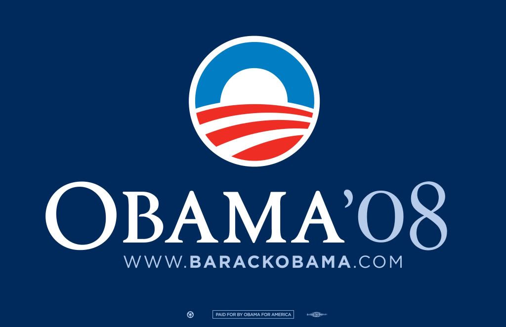
So what's the winning typeface? Gotham! Created in 2000 by American type designer Tobias Frere-Jones,  Gotham's design aesthetic is right up there with Futura and Helvetica. I actually didn't get a great example of the typeface in the poster above...Gotham is not used in the "Obama" part, but the website below it. Anyways, Gotham's generous x-height and quirky geometric sans-serif form gives it openness and allows it to appear official and powerful. However, though much of the signage is in all-caps, the strokes in the typeface are humanistic (thick and thin contrast...not blocky), which evoke a friendliness. Case and point: the big round 'O'. So Obama campaign poster designer people--hats off to you! Good choice! Many people don't realize how long we designers sit staring at a piece of copy, clicking through our font explorers, trying to find the perfect typeface.

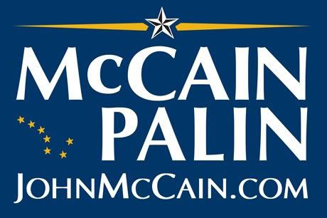
So now for our losing typeface: Optima. Optima was designed in the '50s by German designer Hermann Zapf. So McCain was on the right track here by using a popular sans serif to give off that official feel. Optima, although a modern typeface, has an air of Bodoni (a very old typeface) in it with the high thick/thin contrast in the strokes and the ascenders/descenders. So far we have official, yet classic, which is very McCain. Optima, however, is not as open as Gotham; the forms are closer together, and thus not as friendly-looking. Despite the fact that McCain was all about "real" America, his typeface didn't evoke that openness.

So I'm thinking I really need to go out and purchase Gotham as I've fallen in love with it. Or rather, get my school to purchase it for me...

Monday, November 3, 2008


So, I posted this video for two reasons... 

Firstly, I saw this commercial on TV a few days ago and was in awe of the amazing use of animated typography. Any designer would appreciate the use of letterform in this ad.

Secondly, I thought this was a great campaign by Starbucks. Despite the fact that I'm thinking just about everyone will come in and say "I voted", regardless of whether or not they voted, it's a good reminder of how important it is to vote...especially in this upcoming election. So please please vote Nov. 4. Remember, you are the landlord of the white house--make sure you're renting it out to someone who's not going to ruin the carpeting.

Thursday, October 30, 2008

Beached Lego Man

lego man

I think I died laughing reading this story. An 8ft lego man washed up on the shores of Brighton Beach, England yesterday. So random. Yet, apparently, this beach has a history of beached toys when a fleet of plastic duckies arrived on the shores in 1992. All I have to say is I'm completely jealous. Oh to have my very own giant lego man...

Monday, October 27, 2008

The product of an 8 hour day spent in the lab


Why is it amazing? I have no idea. But somehow, in all its hilarity, it's mezmerizing, like a lava lamp or jello.

Friday, October 24, 2008

Dilbert.com

Thanks, Merrill.

Thursday, October 23, 2008

Episode III - Revenge of...

First, there was Blurty. Then, there was Livejournal. Today, I give you the last chapter of the trilogy: Blogger. It also seconds as a prequel to my soon-to-be website. Go figure.

This Anakin, however, will not be going over to the dark side...or at least not in a bloodied battle that leaves me no more than a stump.

Anyways, like I said, there is a website coming soon. A basic portfolio site and all that jazz. I just finished up some pre-lim mock-ups web design today. However, I think time would be better spent looking for the thermostat in the labs...they've been keeping it at near freezing temperatures...like sherpa jacket temperatures. I propose space heaters... and you know what, we could use a couch in there too. And a cafe. Well, until that happens, all of us students will be up there shivering with 80 layers on. 

And then, I come back to my room and it is probably nearing 100 degrees, with the window open, mind you. These kind of extreme temperature changes can't be good.